
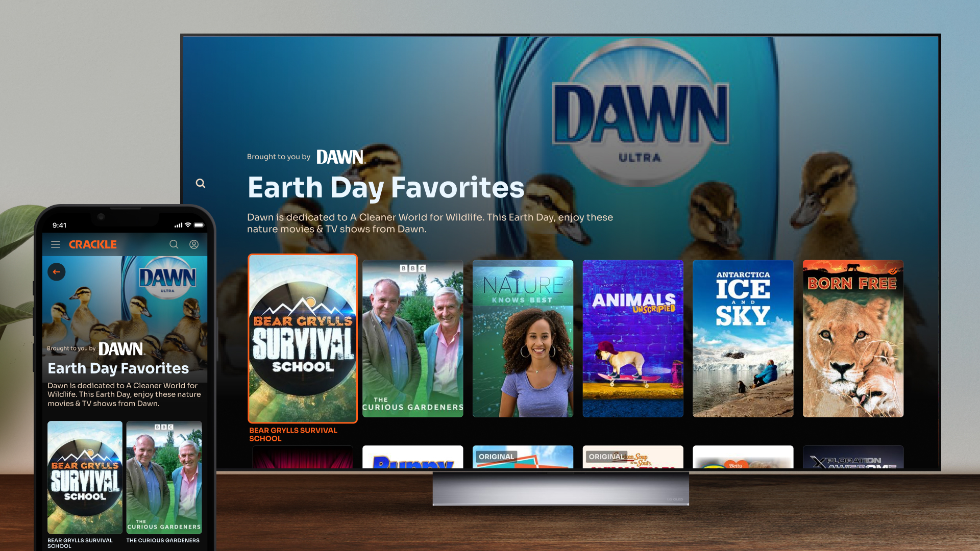
Sponsored Collections
for Crackle
New avenues for exploration and revenue
Role: Product Design Lead
Responsibilities: IA, UX, UI
Team: VP of Design, Director of Product, VP of Ad Solutions, Head of Programming, Web Product Designer, Mobile Product Designer, Frontend Engineers, Backend Engineers, QA
Brief
One of the core principles of the product design discipline at Crackle is "Reusability". That often manifests itself in prioritizing features that benefit multiple groups of stakeholders. That may mean launching a revised version of a card component that improves the user experience and also allows our backend team to deprecate an API version. Or it might mean modifying how content metadata is displayed to reduce work required by our content operations team and improve the user experience. In this case it meant launching a new page type that would give our content programming team greater flexibility with respect to how they present our content library to users, that was also a placement that our ad sales team can sell to our brand partners.
Process
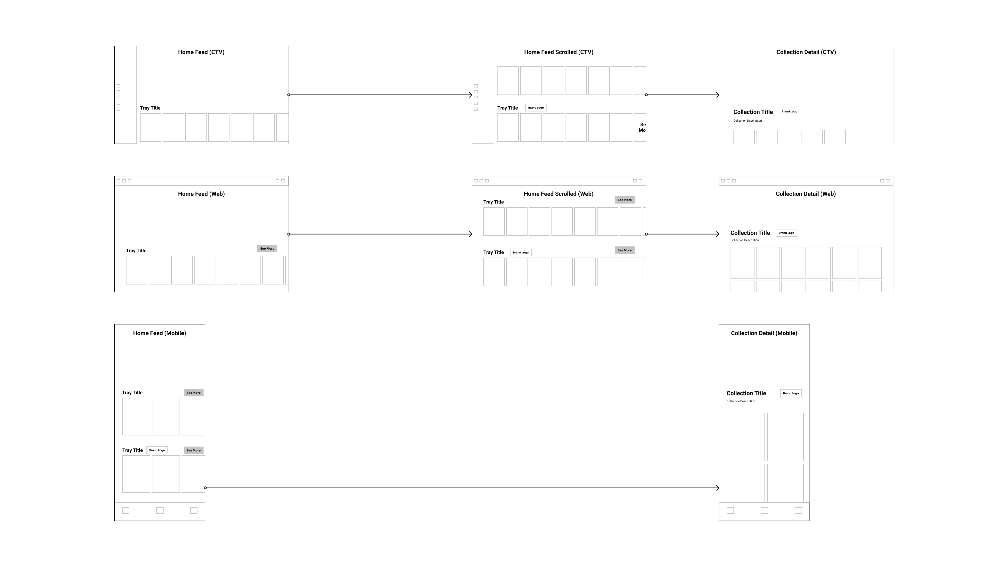
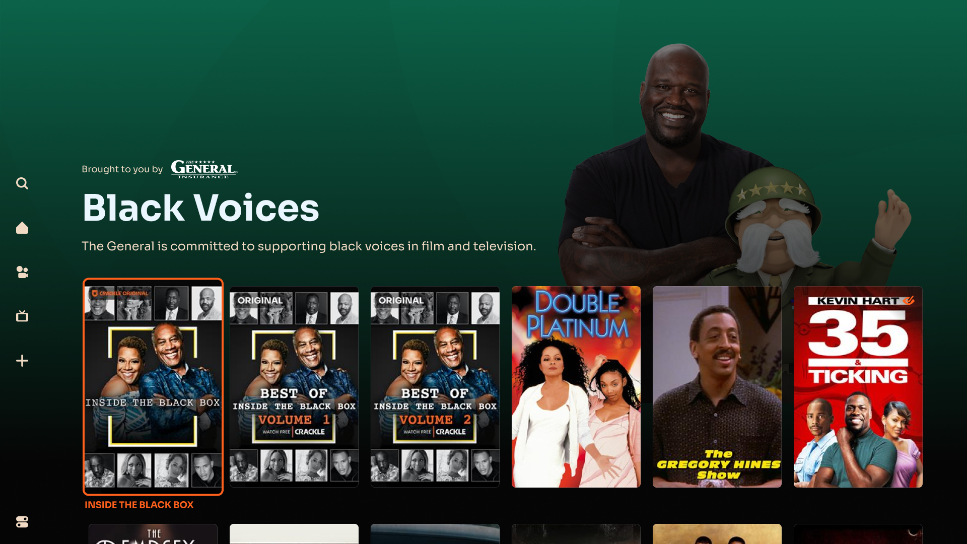
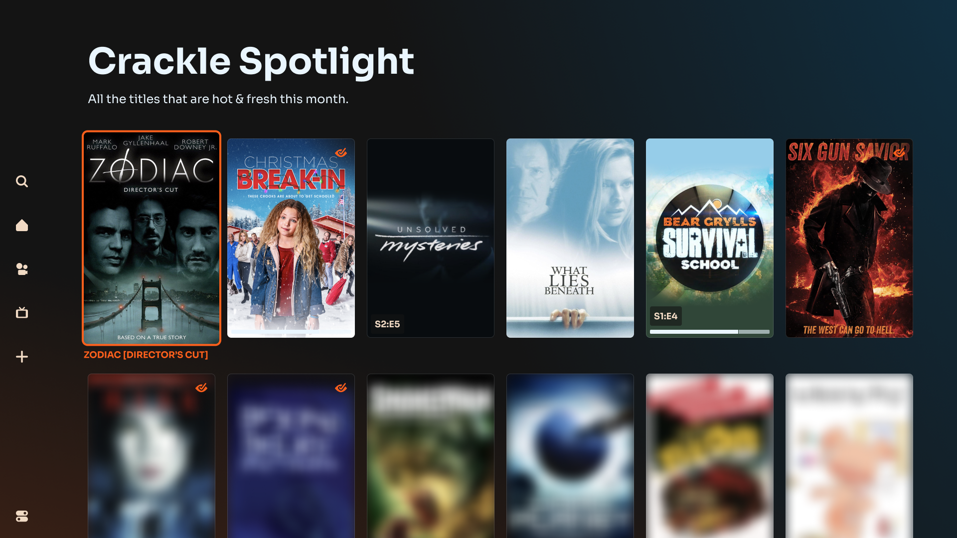
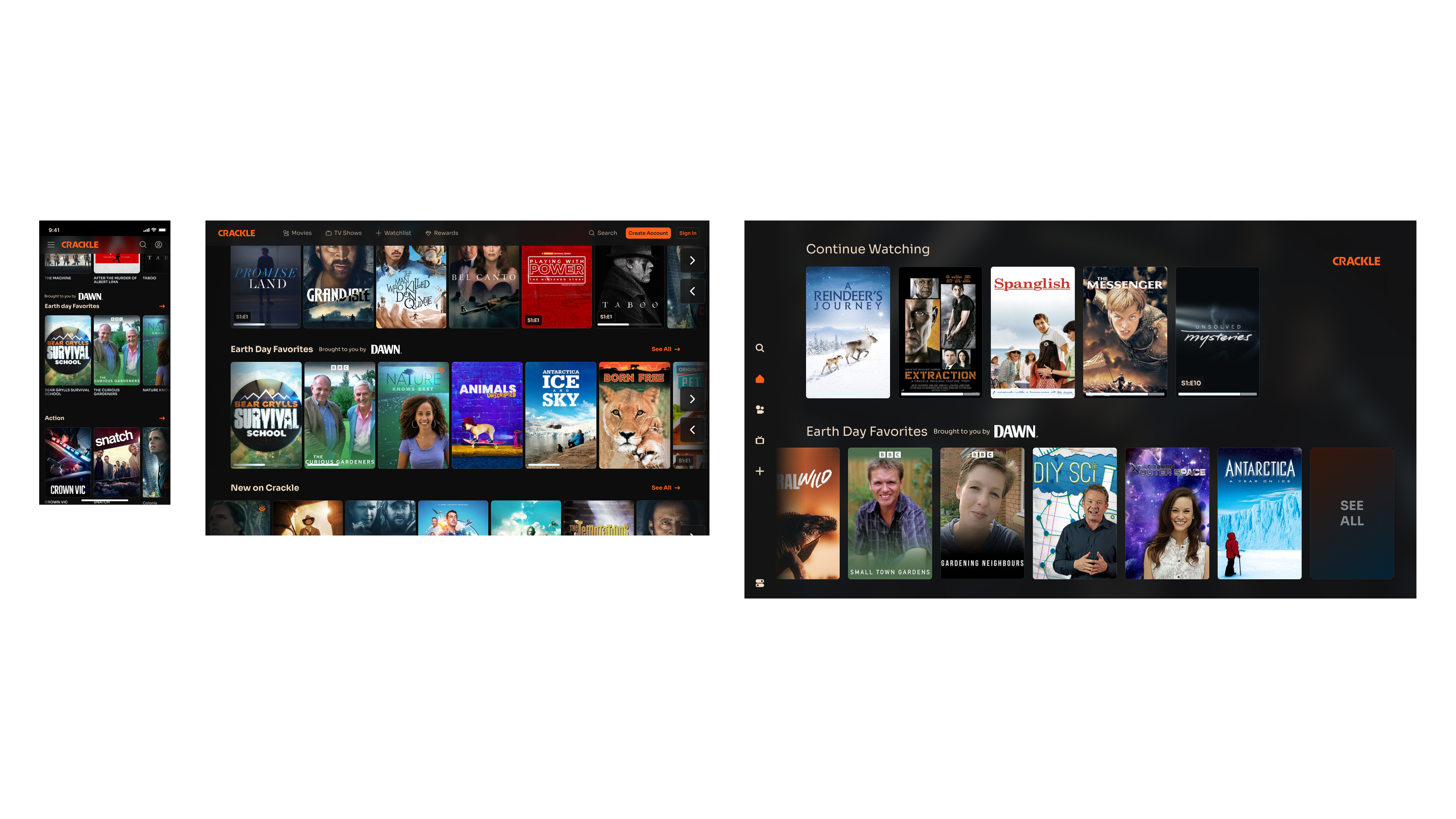
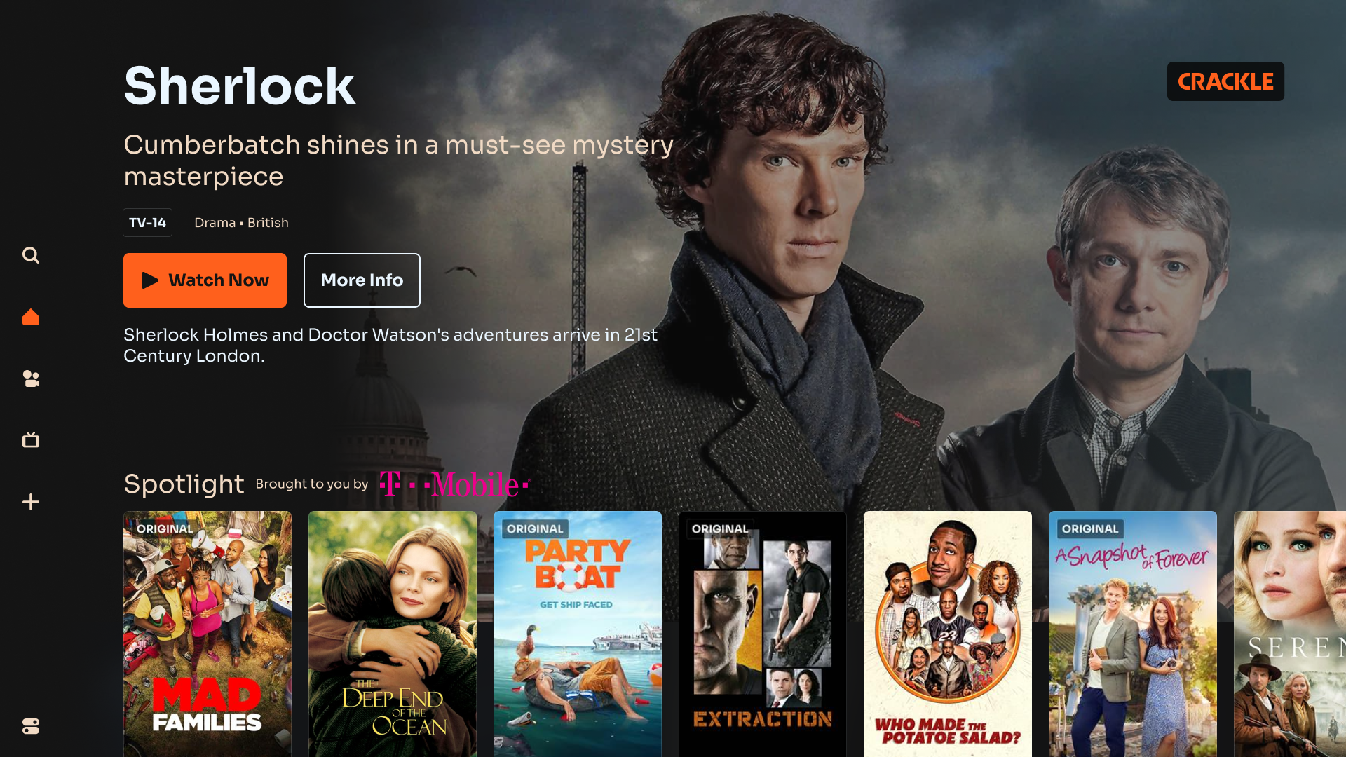
When the new Crackle streaming apps were relaunched, they contained a limited MVP set of features. One of the many features that was missing were additional ways for our content programming team to present content to users beyond a standard tray on the home screen. Through various discussions with product, our content programming team, as well as our ad sales and ad-tech teams we settled on creating the concept of a Collection. A large part of this was due to the fact that we observed a noticeable drop-off on how many users were reaching the end of a 20-title tray, vs. how often users were scrolling through 50 or 100 titles on our Browse genre screens.
By creating these Collections we believed that we might be able to increase exposure to a longer tail of titles than we were able to achieve with our standard trays and allow our content programming team to expand beyond the 20-title limitations of our trays and create Collections of upwards of 50 titles. Additionally, Collections could be sponsored by a brand (leveraging some logo ad placement work we'd already implemented), potentially bringing in additional revenue.
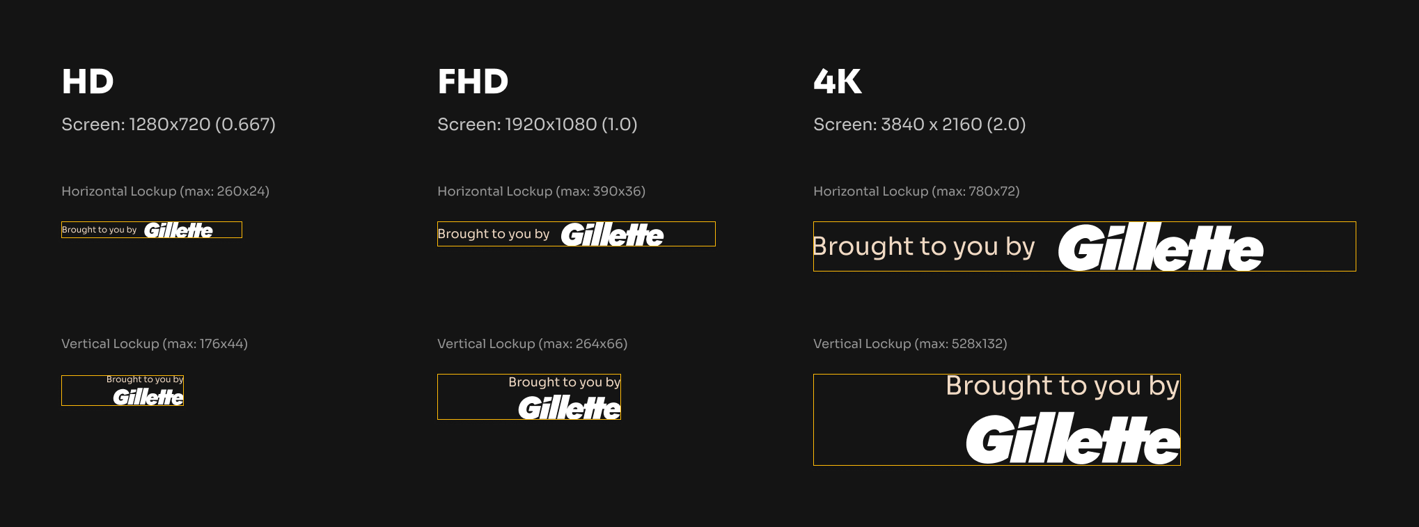

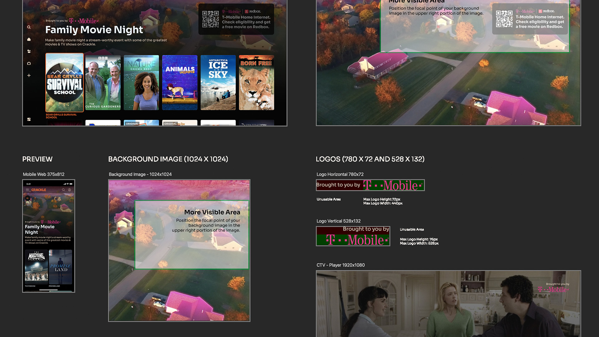
One difficult part of this project was settling on a small, defined set of custom assets that could be used for this feature cross-platform. We went through several rounds exploring different asset sizes and layout treatments considering the impact to safe areas on the screen as well as the lift that would be required for internal or external creative teams to support these Collections.
Another difficult part was actually creating the template for our ad sales team to share with partners to enable them to create the necessary assets for sponsored Collections. Finding the right balance between making these templates restrictive enough to limit possible display issues, while making them flexible enough to let brands put their unique identity into the assets took a lot of testing to get right.
Execution
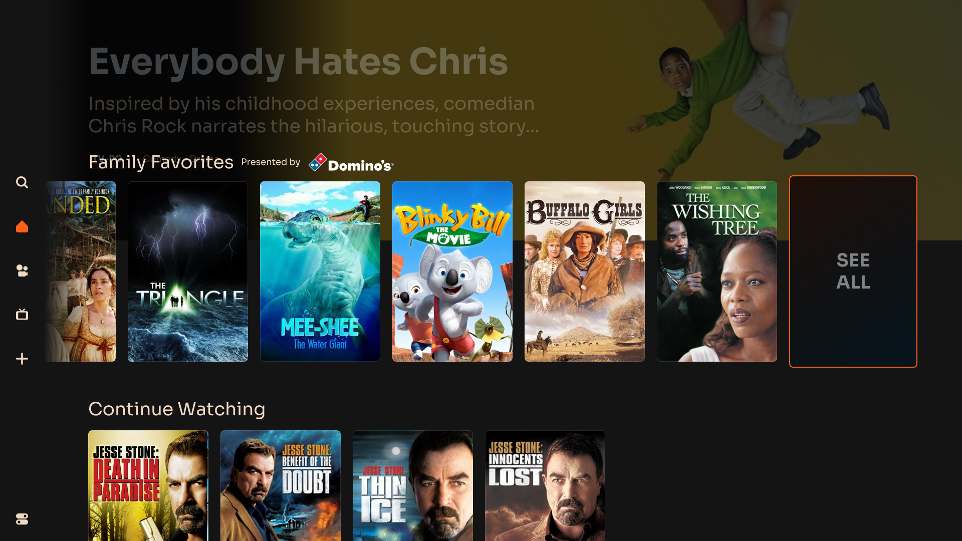
After some initial testing we had two key learnings that helped us evolve the feature. The first was not a surprise but was something we chose to confirm our assumptions before altering, and that was that users weren't reaching the Collection landing screen on CTV as often as they were on web & mobile due to the lack of a static "See All" link. Once we reduced the tray truncation from 20 to 12 we saw a significant increase in the number of users reaching the Collection landing screen.
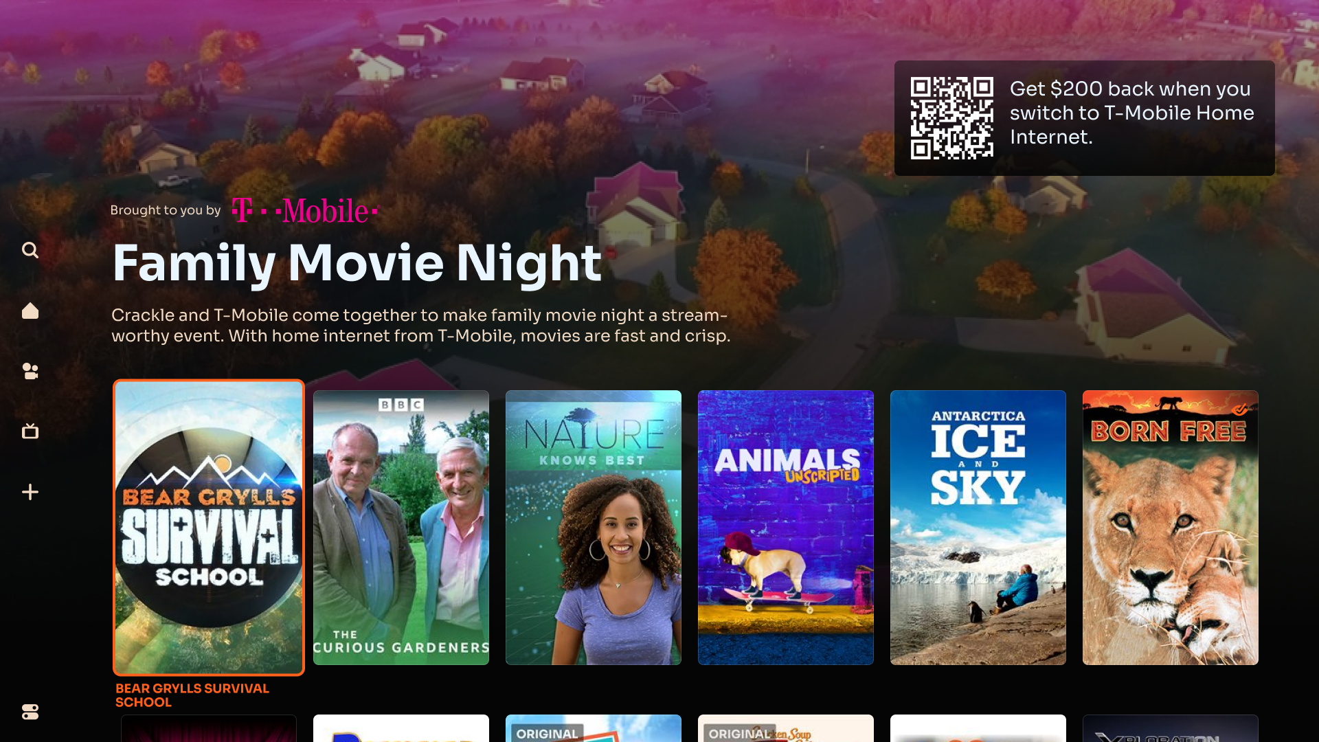
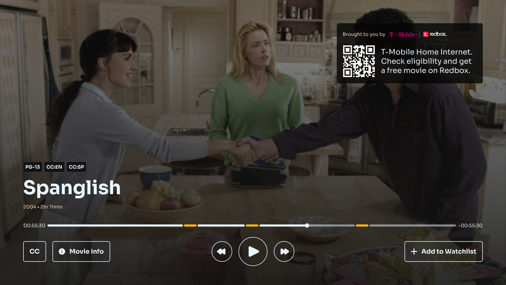
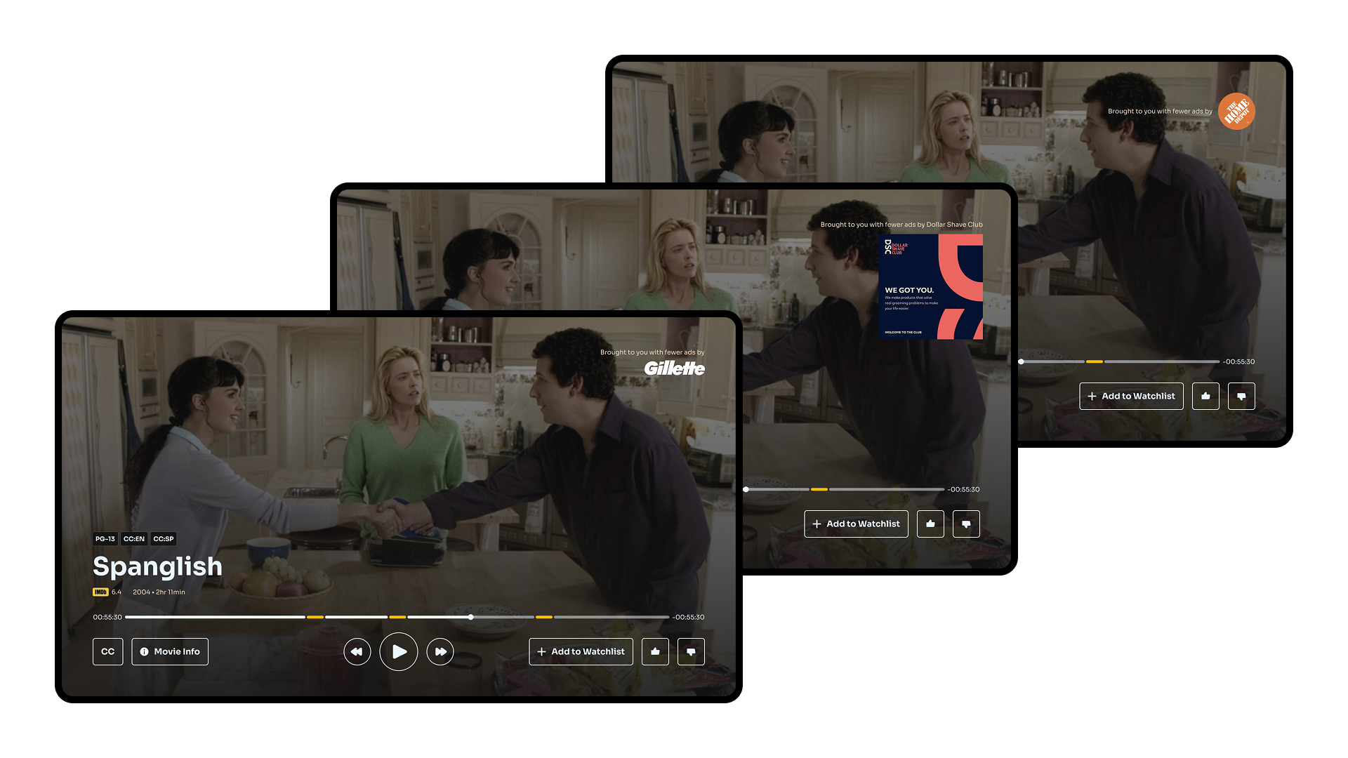
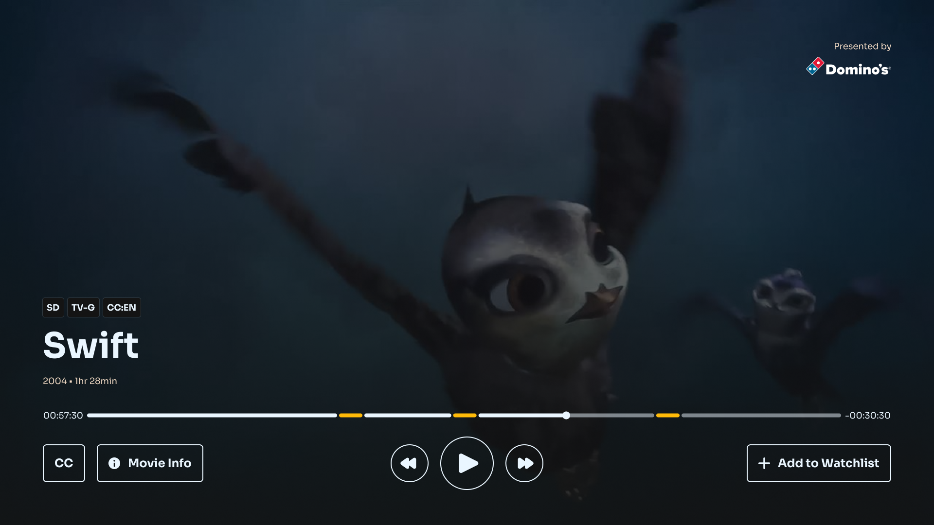
The second was feedback we received from our ad partners. The saw a great deal of opportunity in these Collection screens, but wanted a way to direct users off-platform to help maximize their investment. This was easy to achieve on web & mobile by making the ad logo selectable, but required the ability to display a QR code on CTV. This introduced some additional complexities for the overall layout and safe areas of the Collection landing screen but we decided it was worth it to help turbocharge adoption.
Results
The soft-launch of the sponsored component of this feature was with PetSmart and resulted in over 4M impressions for the collection landing screen with more than 50K users scanning or tapping on the offer. Tangentially we saw a 40% higher completion rate from this original series than other Crackle originals.
Anecdotally, our content programming team loves the feature. They use it every chance they get and regularly refresh the custom background artwork to keep the collections fresh even for the trays that are evergreen on the platform.