
Home Screen Redesign
for Live Nation
Event Discovery
2019 • Product Design Lead
Responsibilities: Research, IA, UX, UI
Team: VP of Product, Director of Engineering, Director of Product, Frontend Engineers, Backend Engineer, QA
Brief
As a part of the relaunch of the livenation.com website, one of the main focuses was obviously the home page, but for a few different reasons.
- It's a high-profile page with several competing internal stakeholders.
- It's one of a few pages on the site that are utilized more for browsing than for information gathering.
- It has the ability to funnel users into a few different sections of the site.
Our primary goal was, as always, to first and foremost sell more tickets. We planned to do that by streamlining the path to purchase, and to juggle the needs of our various stakeholders in the process.
Process
- Mobile first: Everything is mobile first. Mobile is over 3/4 of our traffic and the majority of our purchases, so we always start with mobile and then work our way out to desktop.
- Sketching: I often sketch stuff out, just to quickly get ideas out of my head, and do some low-fidelity explorations.
- Wireframe, wireframe, wireframe: For larger, open-ended projects like this we go through several rounds of wireframes and low-fidelity prototypes, often presenting wireframes to stakeholders for approval. That helps us get feedback earlier in the process, and also lets us limit the scope of their influence during the design process.
- Deliberate layouts: Additionally, for features that have a long lead time some of our initial explorations are used to frame and shape decision-making conversations with executives and our CEO.
Initial Options
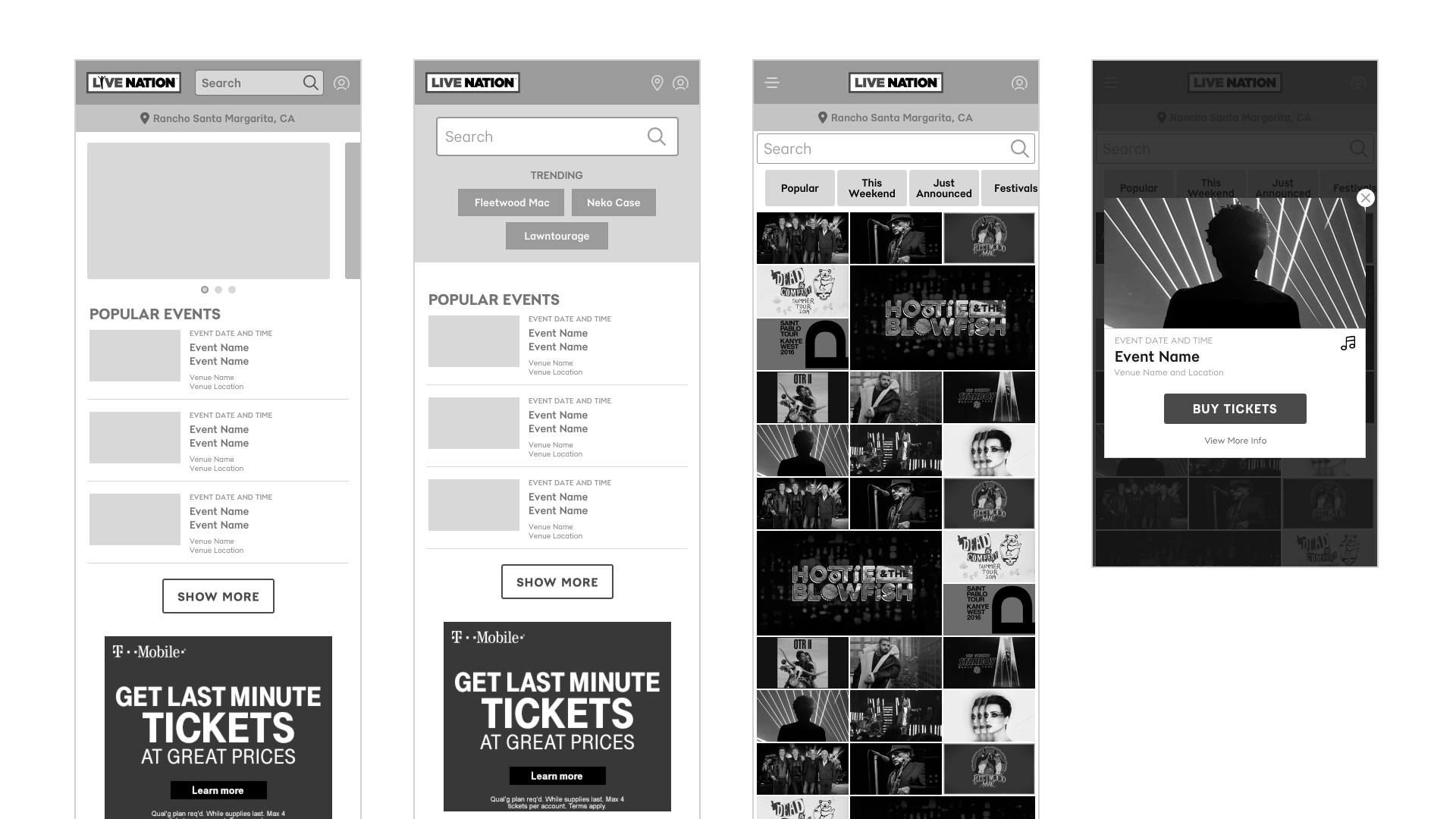
As is often the case, the initial wireframes we develop are mostly for outlining a few different directions to gauge stakeholder preferences and priorities, while trying to shape the conversation in our preferred direction.
When we started on the home page we explored a variety of different combinations and variations that eventually were narrowed into three main directions.
- First, a search-forward version where the hero of the page was a search field with a few tags to highlight major tours. This would put the most-used feature of the home page front & center.
- Second, a version where search was less prominent and superseded by a large carousel, which would let our tour marketing team get their major tours of the summer in front of as many eyeballs as possible, while still giving search some prominent real estate.
- Third, a very image-focused, browsable experience, that still kept search prominent. This version was initially included as a "what's something that could be cool but would never get approved" option. But it hung around because whenever we had a temperature check session with stakeholder it kept eliciting a very positive response. It's intentionally very, very similar to Instagram's search page to help bridge the gap between something that our stakeholders are familiar with, and a layout that would be very foreign to our site.
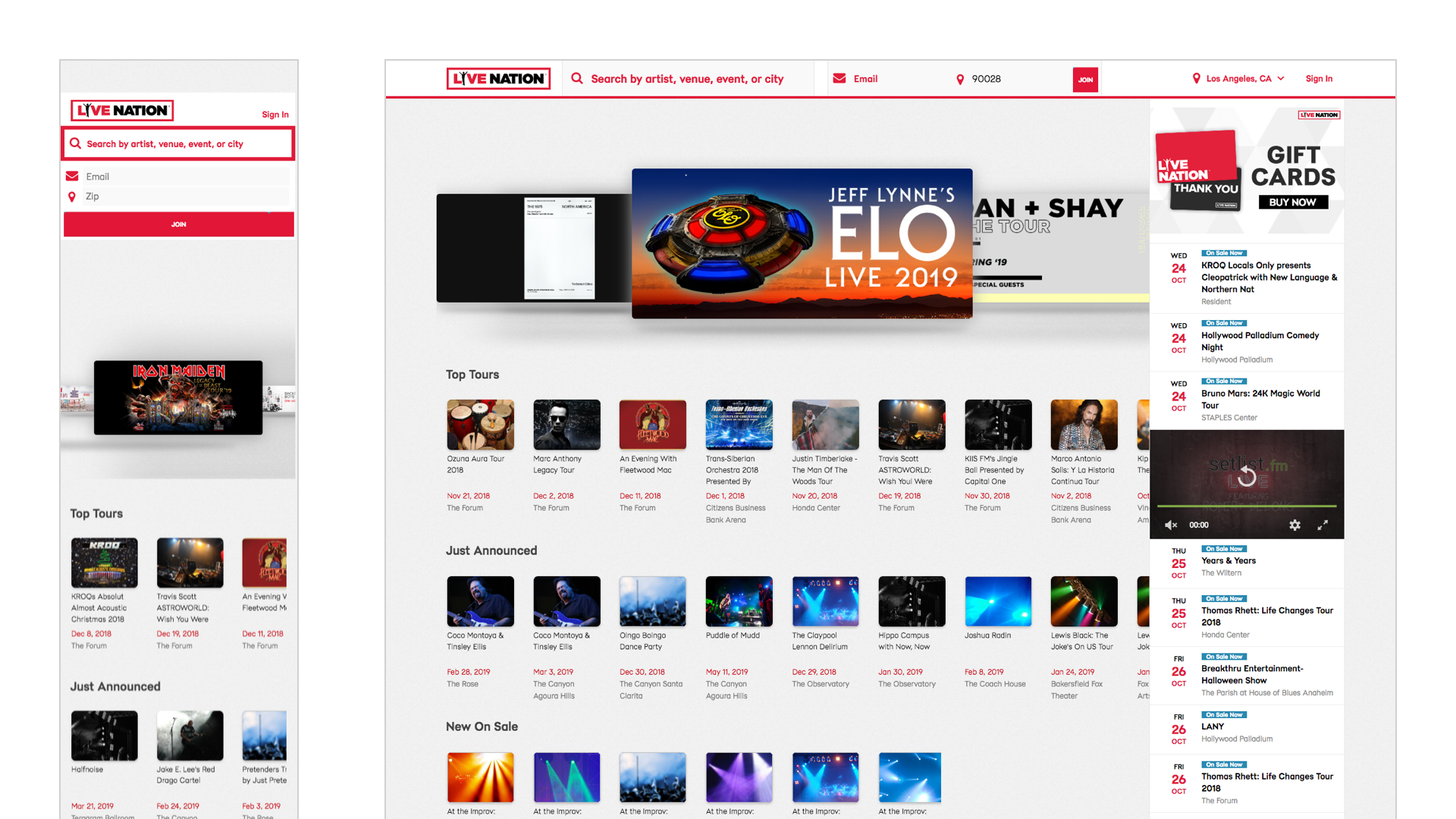
After continued iterations, stakeholder reviews, and ultimately the CEO's final decision we ended up with a layout that was sort of an amalgamation of the three. The carousel won out as the featured layout element on load, with search positioned above it but taking a less-prominent role. To attain that browsable, scrollable experience we utilized a card-style listing with a large image. We explored different types of cards, obviously event cards, potentially artist cards with a few nested events for the artist, and cards for local venues, which could also include nested upcoming events. But due to the fact that a user has to be logged in for us to have access to their favorite artists, and for local venues to be somewhat spotty, we relegated those to subsections of the page and not the main "feed."
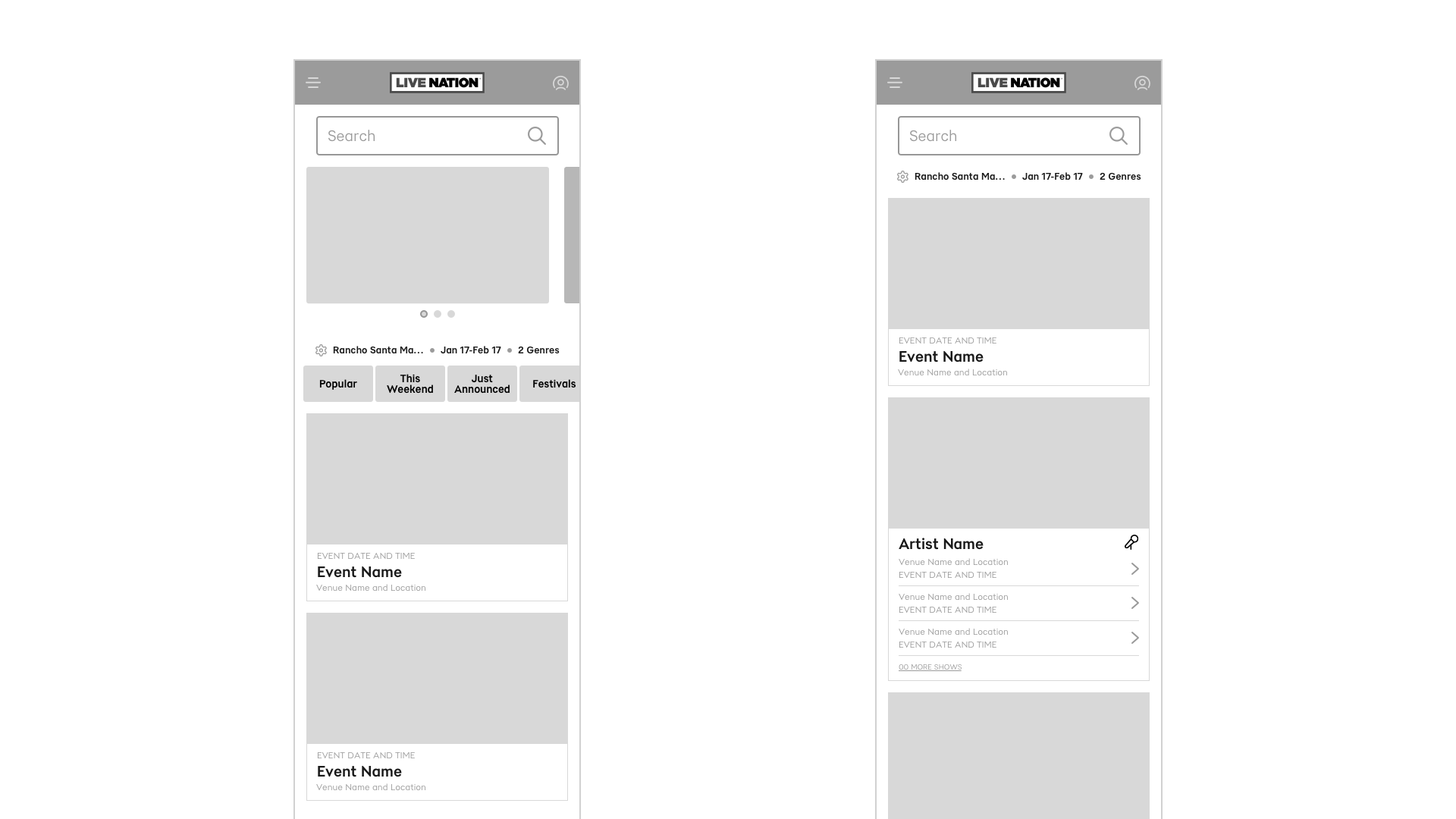
As we started to solidify the content we'd be displaying we shifted focus to how to display that content. One of the primary goals we were given was to reduce friction on the path to purchase. The previous iteration would pop up a modal every time you selected an event and would ask you if you wanted to buy a ticket, or see more information about the show.
We decided to eliminate that speedbump and instead send users that select a given show directly into the purchase flow. The next piece of this puzzle was deciding exactly how much information about a show to display. We wanted to show as little information as possible, to simplify the card visually, and avoid overloading the user with information. But we also needed to give them enough details that they wouldn't panic when they land on a purchase screen after selecting an event card.
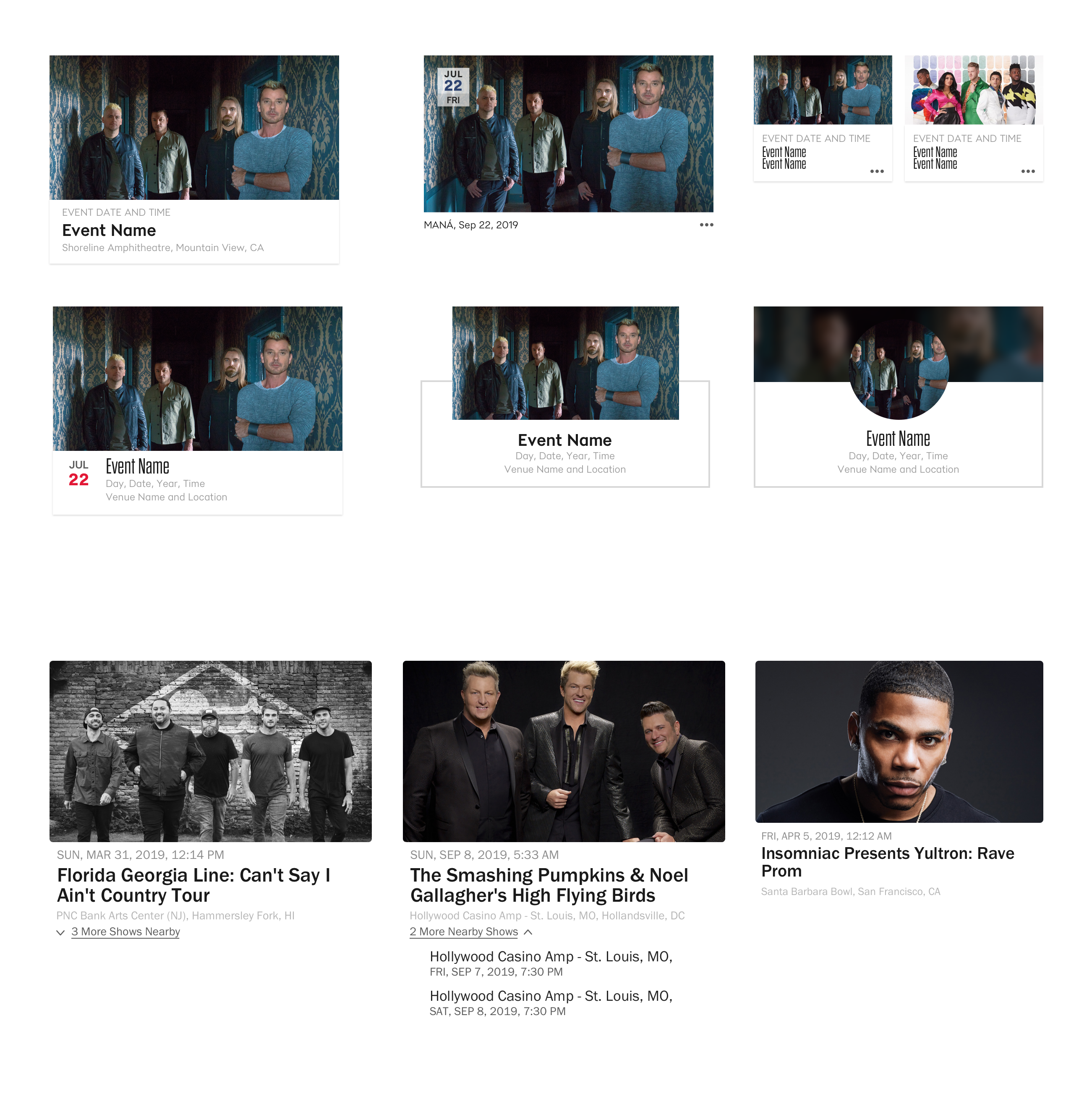
Continued Iterations
In an ideal scenario, this would've been a perfect opportunity for some extensive user testing, but given the extraordinarily tight timeline we were working under, we simply couldn't afford to burn cycles by taking a methodical approach to identifying the card style users identified with most. At the very least it would have been nice to have started with some simple surveys about what data points users care about here, and in what priority. Then, getting user feedback on some card mockups or prototypes would've been a useful next level.
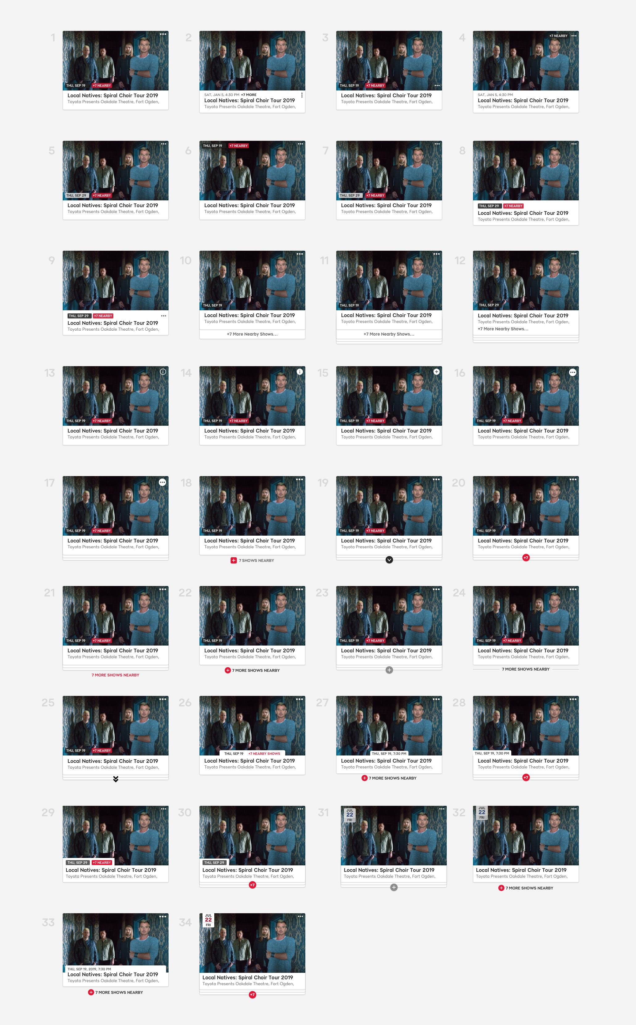
Instead we had to rely on what little analytics data we had on this topic, and make some inferences from other similar research that had been conducted. Obviously the event name and location are critical pieces of information. We decided the date and the day of the week were necessary, but left off time. The assumption being that whether the show starts at 7:00PM or 7:30PM is likely not going to be the deciding factor on whether or not you go see Elton John on his 5th farewell tour five months from now. But it would have been nice to have something more to back up those decisions.
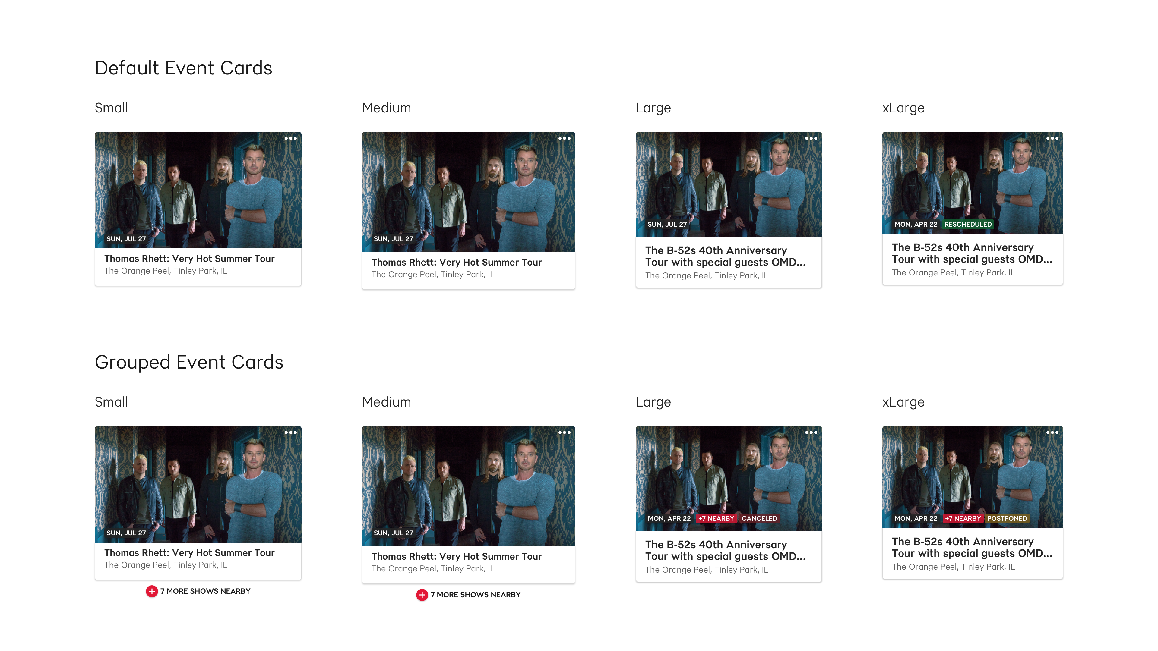
I also would've liked to have done some testing on the layout of the cards themselves, specifically the card style we landed on vs. a traditional listing. Since the content of the two components would be largely the same — they merely differ in visual styling — I think we could've easily done some comparative testing. There were some lingering questions or hesitations about just how few shows a user sees with each scroll, and that more shows per scroll could improve conversions, but that's not something we've tested yet.
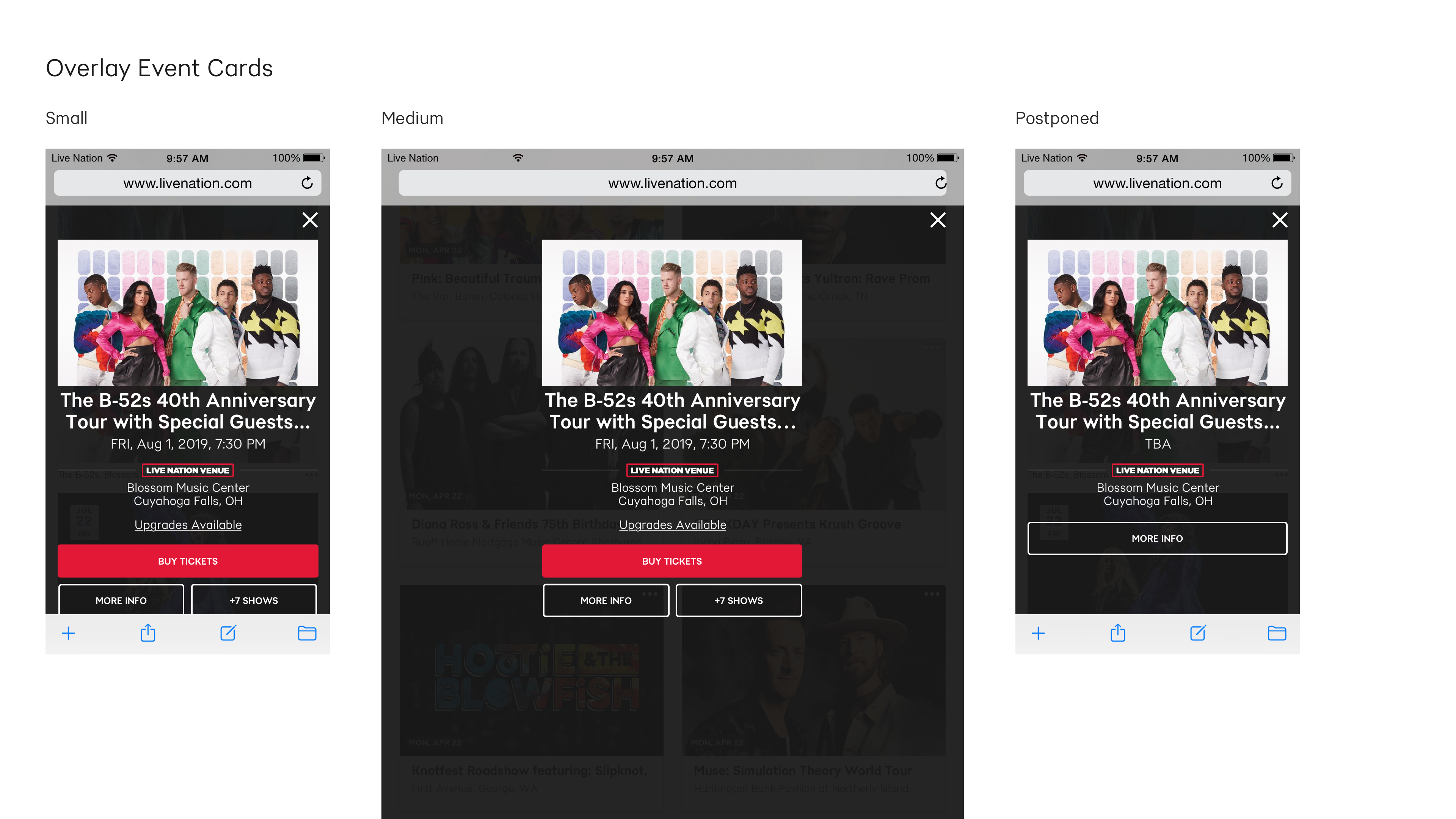
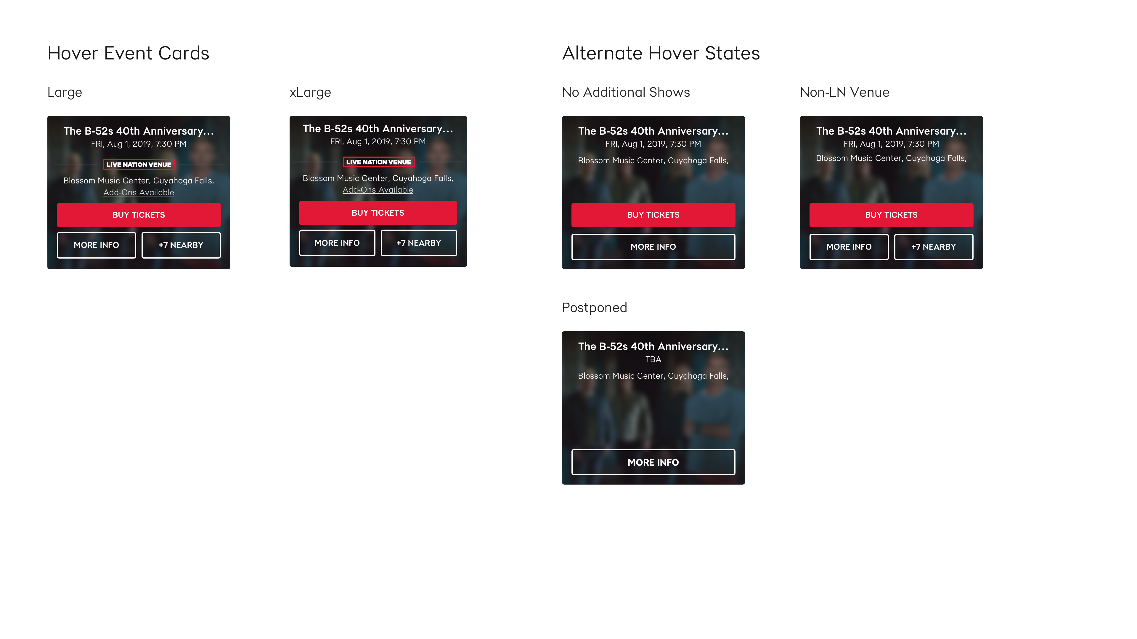
Lastly, the UX we ended up with for the "overflow" where we display show information that isn't displayed on the card, like the full date and time — whether or not it's at a Live Nation venue and if there are upgrades available — utilizes and ellipses that reveals a modal on mobile and table screens and a hover state on desktop. I've always wondered if the hover is in fact the superior interaction for desktop screens, or if the ellipses is a better solution across the board. We also did no testing as to whether or not the ellipses was a suitable CTA to trigger the expanded view. Do most users even notice it's there, and what it means? Hopefully once live events return we'll be able to answer some of these questions.
Hero Carousel
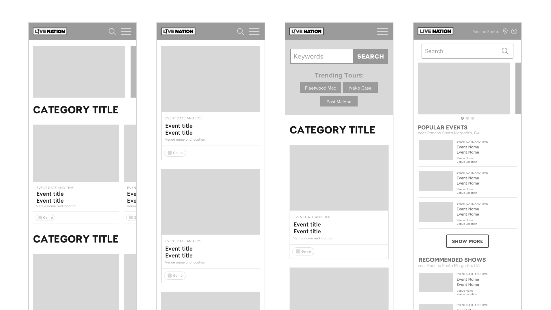
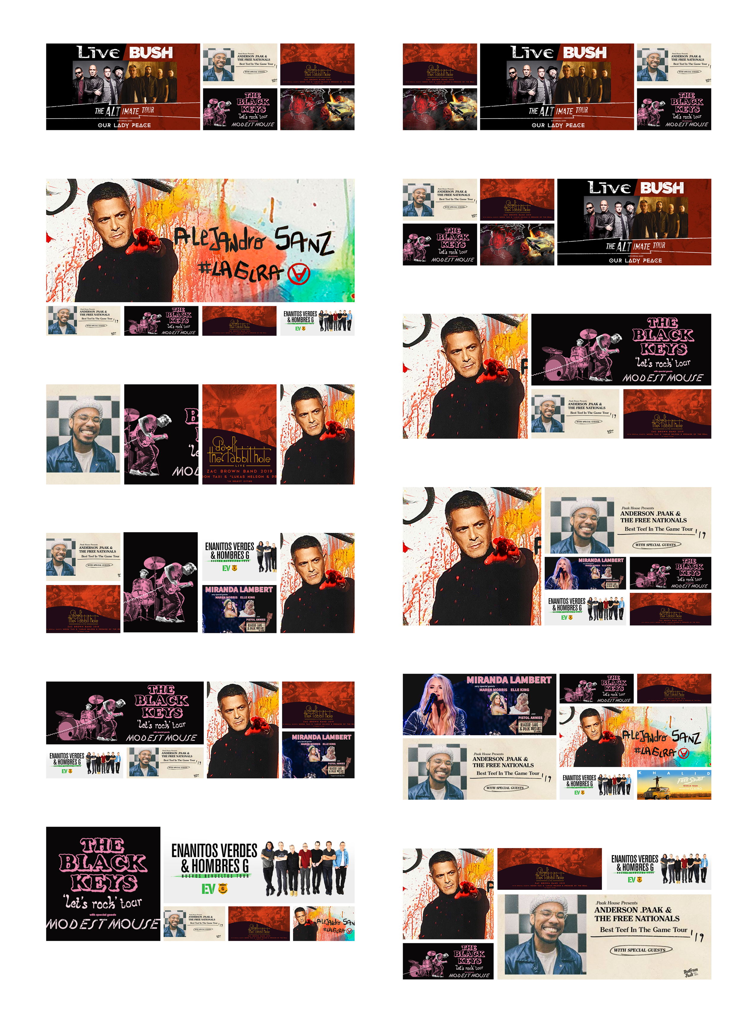
In addition to many iterations on the cards, we also explored a few different layouts for the hero "carousel." Statistically, carousels are historically very underperforming features. Most users never make it past the first, let alone the second carousel item. And click-throughs drop off equally precipitously. Surprisingly the previous version of the Live Nation website bucks that trend. Next to search the carousel is one of the most utilized feature on the home page. The belief is that because we're often promoting are largest tours, these carousels appeal to large segments of visitors to the site accounting for their high click-through-rate. In an effort to buck the low viewability of later items in most rotating carousels, we opted for a static carousel on desktop. We sold this to stakeholders by reminding them that it would still require the same prioritization of order that the old carousel would require, but that the overall viewability of all carousel items would increase.
Results
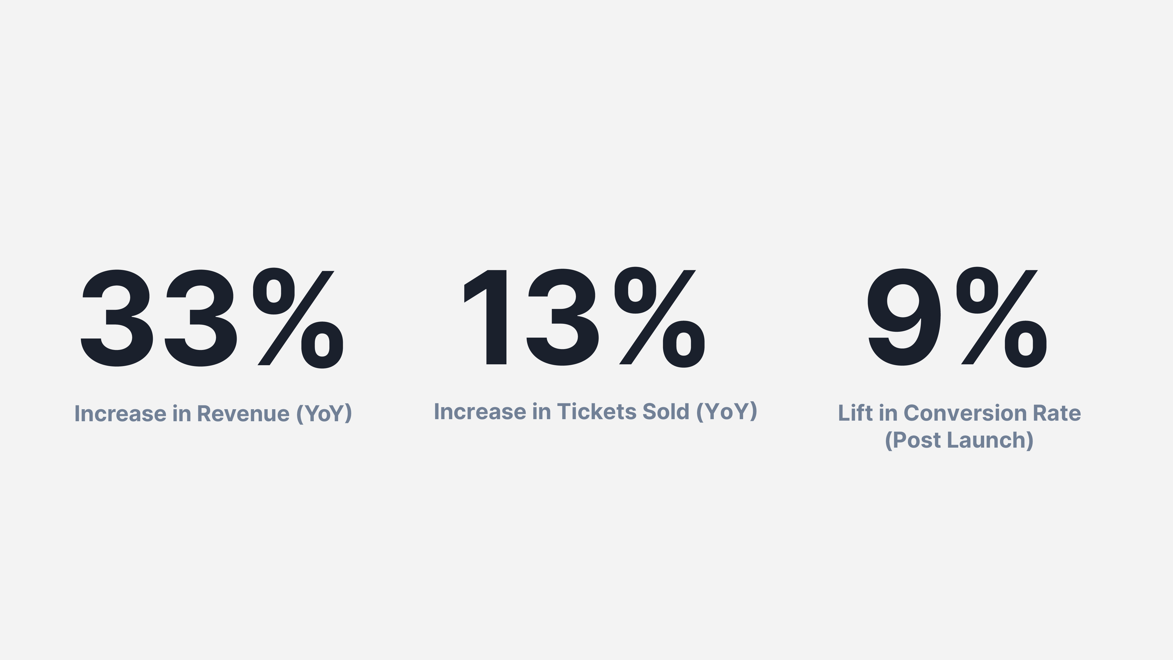
In the end, despite all of the hurdles we faced we were able to launch a new home page with much improved discovery experience.

Little did we know, when we finally scaled up the new site to 100% of traffic in February of 2020 we would have about one month to collect data before live events would vanish in the wake of the COVID-19 pandemic. It's hard to draw too many conclusions from such a small set of data, but the early results were promising, and we look to build off of those gains when live events return.
Other Screens
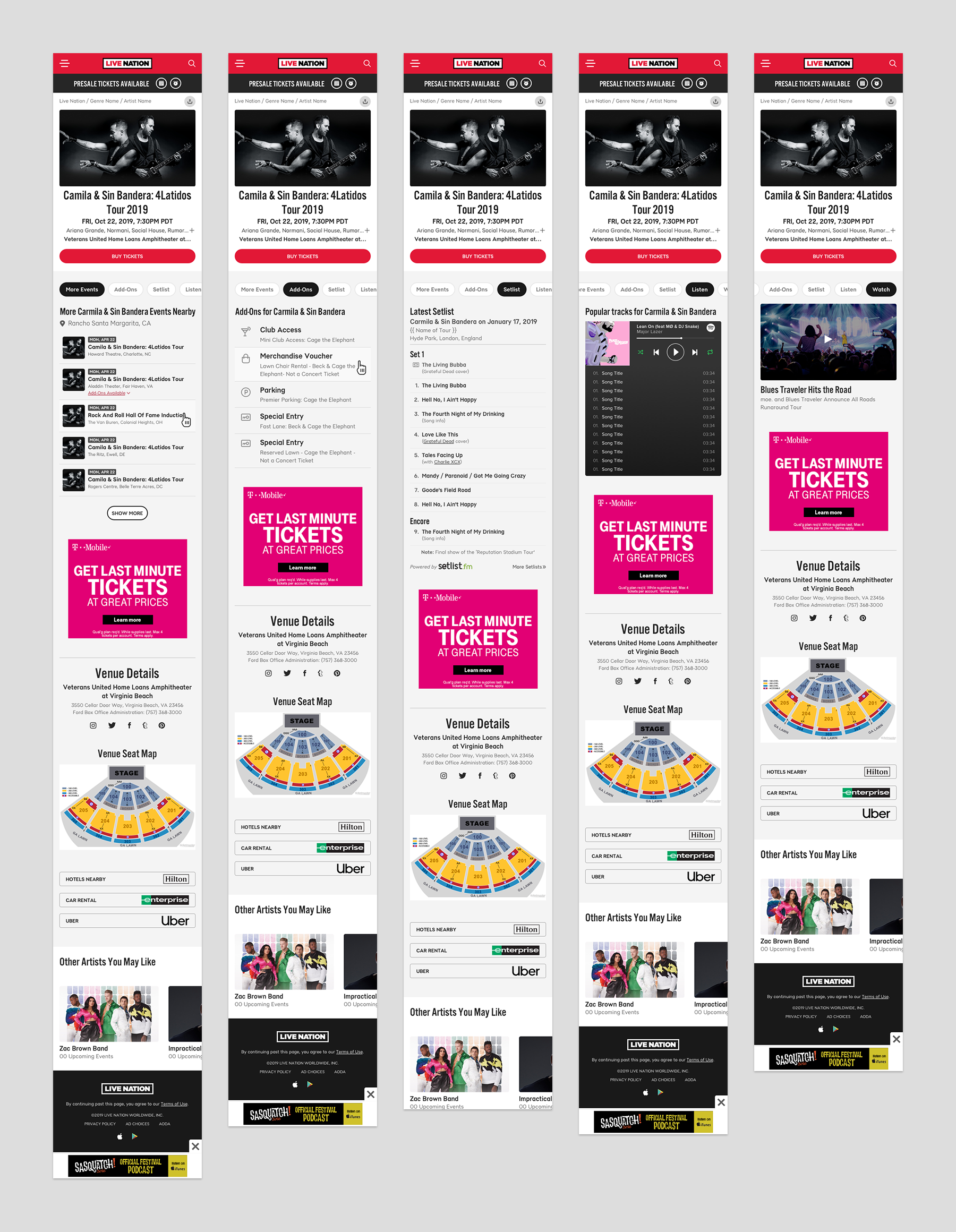
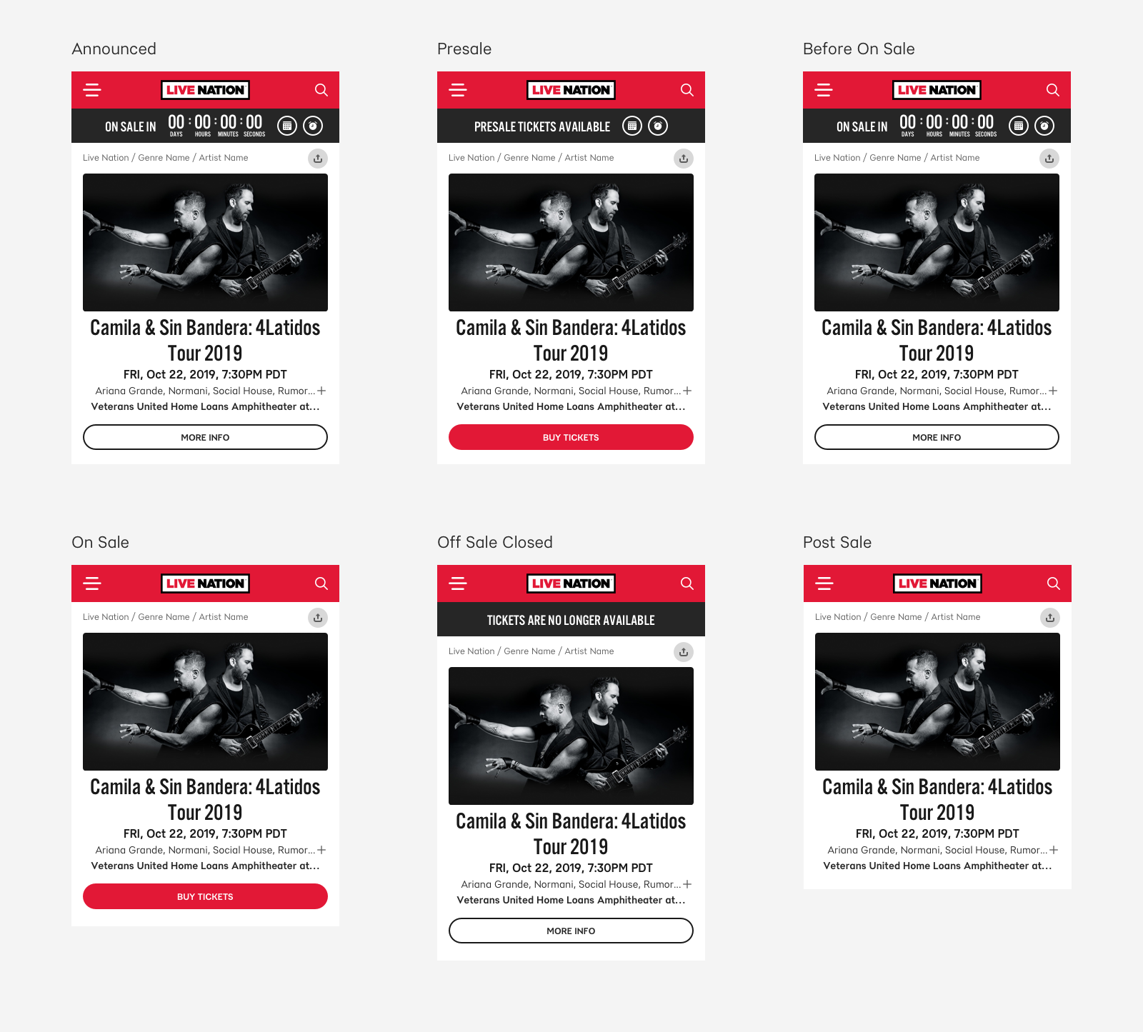
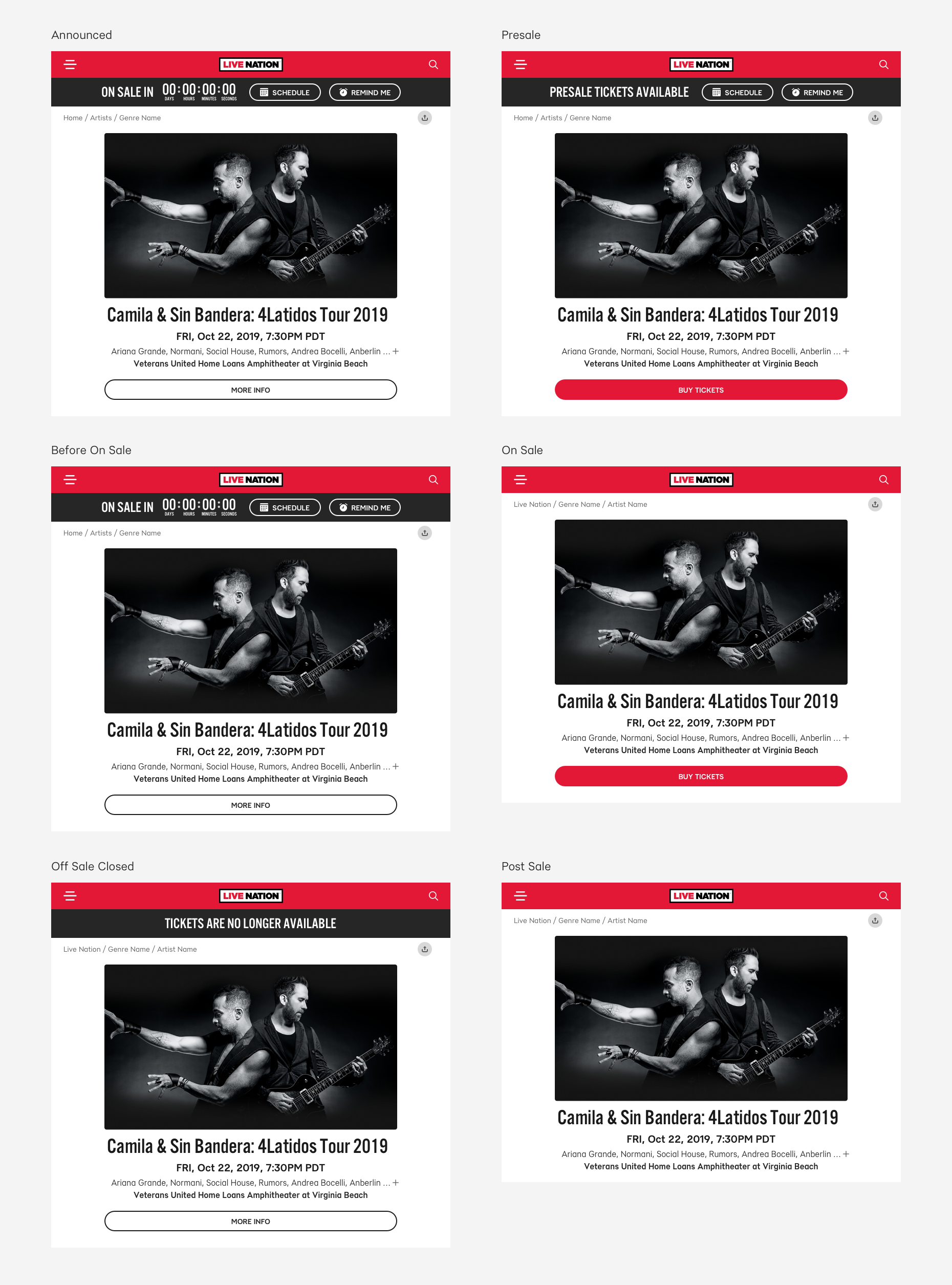
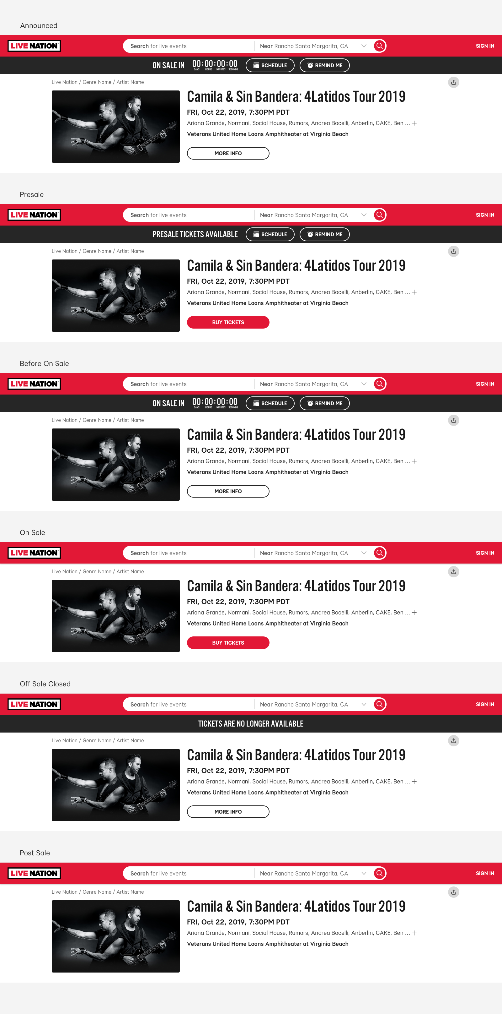
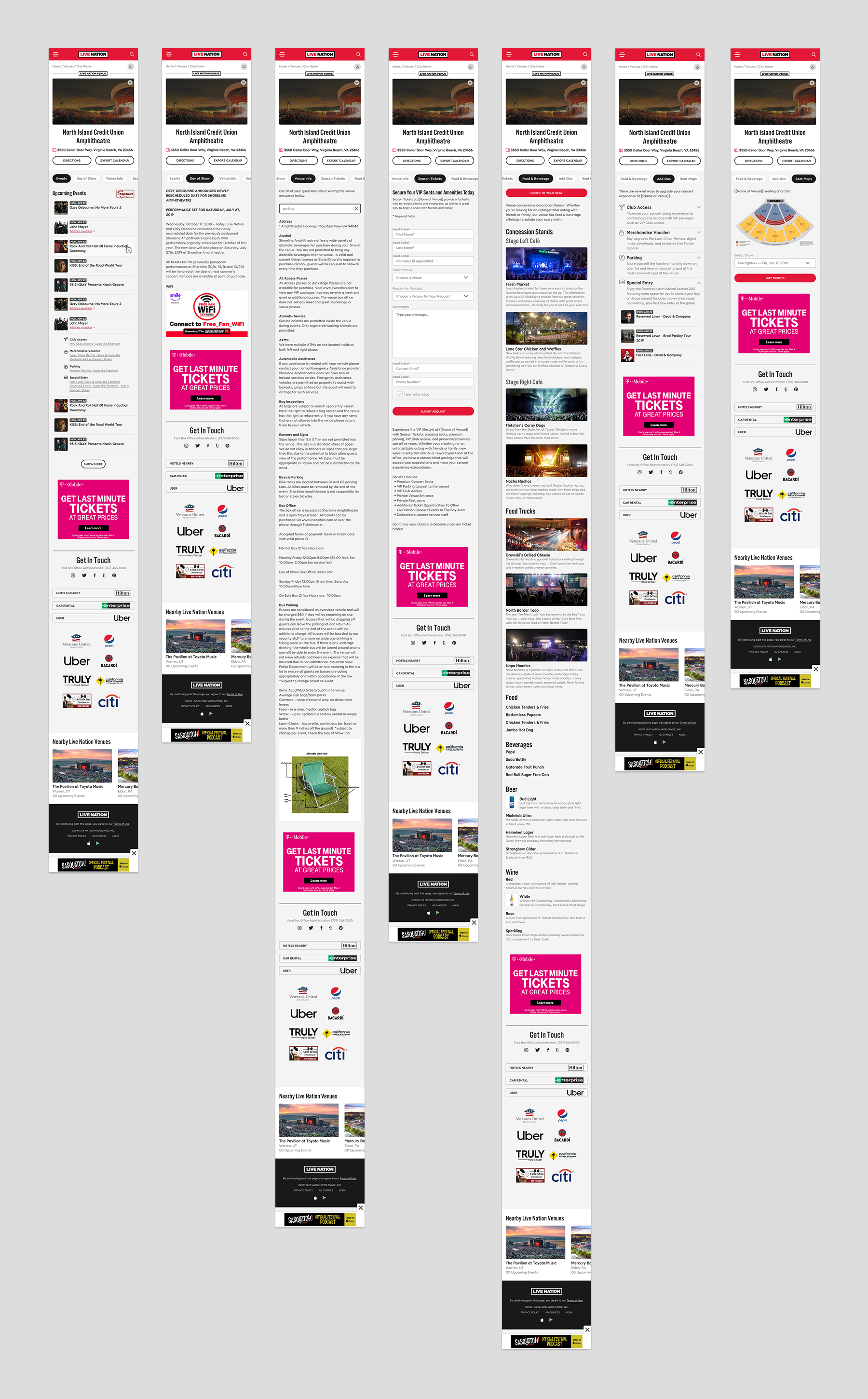
In addition to the home screen and the search experience, all of teh other primary screens for the site such as the event detail screen, artist detail screen, and venue detail screens also got a refresh.
